10 BookWidgets design tips to spice up your digital lessons
 Lucie Renard —
You already know how to create amazing digital lessons with BookWidgets, I’m sure. But do you know how to make your lessons stand out even more?
In this blog post, I’ll give you 10 design tips to spice up your BookWidgets activities. I’ll tackle the easy design options, and I’ll also show you some real professional design tips.
How to change the design of a BookWidgets activity?
When you want to change the design of a widget or a BookWidgets exercise, you have to go to “Preview” and click on “Design”. Here, you get a few extra design options. You can change the color, font, and add a background image.
Teachers that have a school license (i.e. where the school bought BookWidgets accounts for their teachers) are in luck! School licenses have even more design options. You’ll be able to change the design of almost all aspects of your widget. However, remember that it takes some time, so you need to decide if changing the complete widget design is worth your time.
In the tips below, I’ll indicate with a star what’s possible. If the tip’s indicated with one star (⭐️), every teacher can use this tip. If the tip is indicated with two stars (⭐️⭐️), only teachers with a school license can use this tip.
10 BookWidgets design tips to spice up your digital activities
1. Add a background image ⭐️
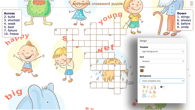
This is the most basic design tip, with the biggest impact on your widget layout: simply adding a background image to your widget. Bring your widget to life with a fitting image, or use the background image as part of your lesson. Here’s a simple example:
The background image makes your exercise stand out, and immediately shows your students what antonyms are. In this example, I also changed the color to orange so it blends better with the background image.
Extra background tips:
You can choose how to format your background image. Personally, I always go back to the “Cover complete area” format option. The image will be spread over the entire widget, even if students open the exercise on a smaller or larger screen.
When adding an image, choose the “Find image online” option to find copyright-free images in just a few clicks.
Can’t find the right image for your course? One of our creative interns, Maude Moors, designed beautiful background images for every course. Click here to check out the background images and download them for free.
2. Change the font ⭐️
If you don’t like the standard font (=Verdana), you can change it to another font. BookWidgets has 45 fonts to choose from.
Make sure your students can read it, though, as some fonts are hard to read. Some fonts read better for dyslexic students. Make sure to use sans serif fonts, such as Arial and Verdana, as letters can appear less crowded. Alternatives include Tahoma, Century Gothic, Trebuchet, and Calibri.
3. Change the font size ⭐️⭐️
The ideal font size is somewhere between 16 and 19 px. The default settings in BookWidgets are usually fine, but if you have students that have trouble reading, you can change the font size.
This is only possible in the additional design options; here, you can change the font size for the title, question, answer possibilities, and built-in dialogues. It will take a bit more time, since you have to configure it all separately.
Check out tip number 10 to learn how to create widget templates. This will make it easier for you. You just have to configure the design in 1 widget, and can always start working from that one. You don’t have to start from scratch over and over again.
4. Add a dark background to keep an eye on students ⭐️
This is a tip for teachers that want to use BookWidgets quizzes in their classroom to test students. It’s also for teachers that are not using a Safe exam browser, which locks students in a browser to prevent them from cheating.
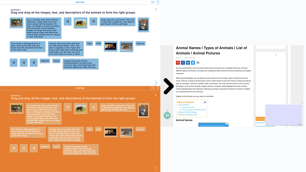
Add a dark background to your widget. Choose a bright color that most other websites don’t use. You’ll immediately notice when students stray from their widgets and open another website. The contrast with your widgets will be immediately visible, even from a distance.
A quick example. Which background switch will you notice faster? The blue-in-white or the orange one?
5. Add your school’s identity layout ⭐️
Remember the paper worksheets you used to hand out? Most of the time, the school policy asks to hand out worksheets with the school logo on them. You’d add a school header where students could add their name, classroom, and date, next to the school’s logo.
In BookWidgets, students don’t have to add their name, classroom, or date at the beginning of a worksheet anymore. This happens at the end of an activity, or it gets filled out automatically (when you use an LMS integration).
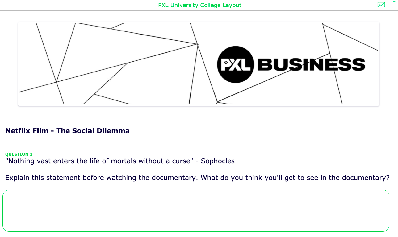
But, you can still add your school’s identity layout as a header. You can add this in the first question in your Worksheet widget. Choose a Text question and add a wide image with the school’s logo (and information). Change the colors in the design tab to go with your school’s identity.
This is how it looks for my school:
6. Play with layout inside questions ⭐️
Some question types in BookWidgets have extra design options in the question configuration itself. This allows you to tweak the layout with a standard teacher BookWidgets account.
Let me give you some tips.
Fill-in-the-table question
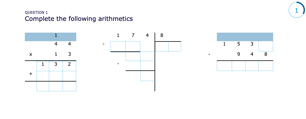
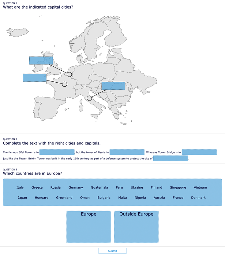
The fill-in-the-table question allows you to format the cells yourself. This makes it possible to make all kinds of exercises. Play with the border options, cell color, and more. A normal table looks a bit common.
Check out this quiz example with a few different exercises, all made with the fill-in-the-table question type. I’ve shared a link so you can take a copy of this quiz, so you can take a look at the question settings and use them yourself in the same way.
Drag and drop text/ images question
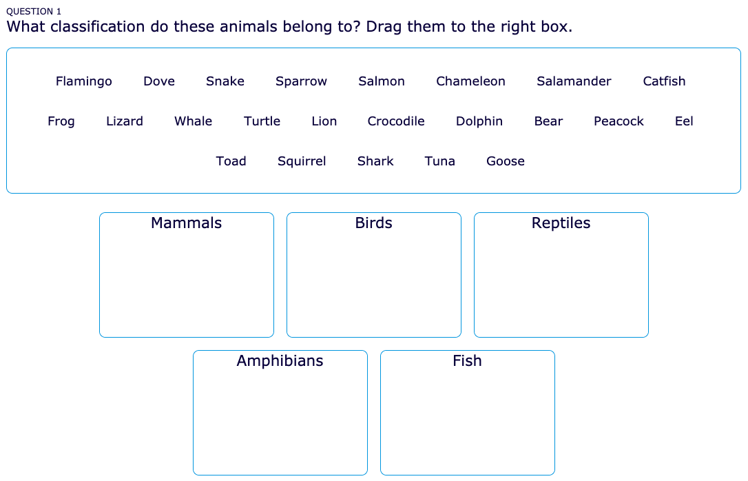
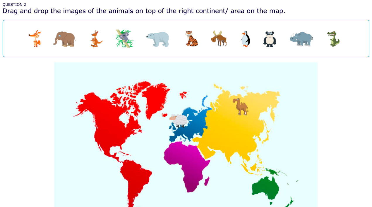
In a normal text or images drag and drop BookWidgets question, students have to drag and drop items in the right box. Check out the example below of the question types with normal settings:
However, you can go much further than this! Both question types have advanced options to change the questions’ layout. Check out the example below. Add a background image, determine the place of the boxes, and play with the drop box options. Here are two handy tutorials that will explain how you can make these advanced text drag & drop and image drag & drop questions in BookWidgets.
7. Add a cover image ⭐️
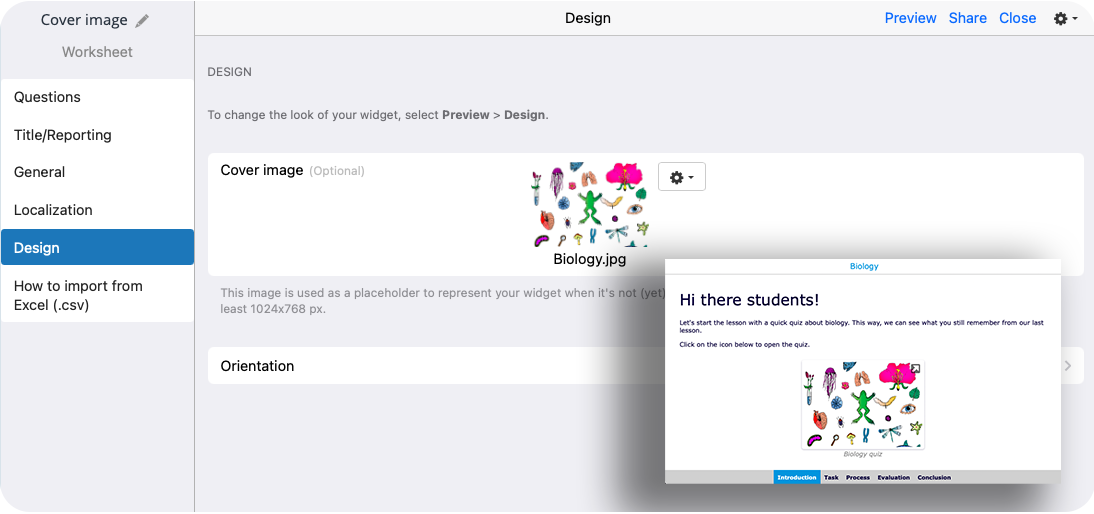
When you want to add a widget inside a WebQuest or Planner widget, the widget icon will always show. You can change this, and show another “cover image” representing the widget instead of the normal icon.
Take a look at the image below. First, I added a cover image to my worksheet. Then, I added the worksheet in a WebQuest widget. The cover image will show now in the WebQuest too.
8. Change the input fields layout ⭐️⭐️
With the school license design options, you can change almost everything in your widget design. However, be aware that it will take some time to configure a widget. If you’re happy with the standard design, you can choose to keep it like that.
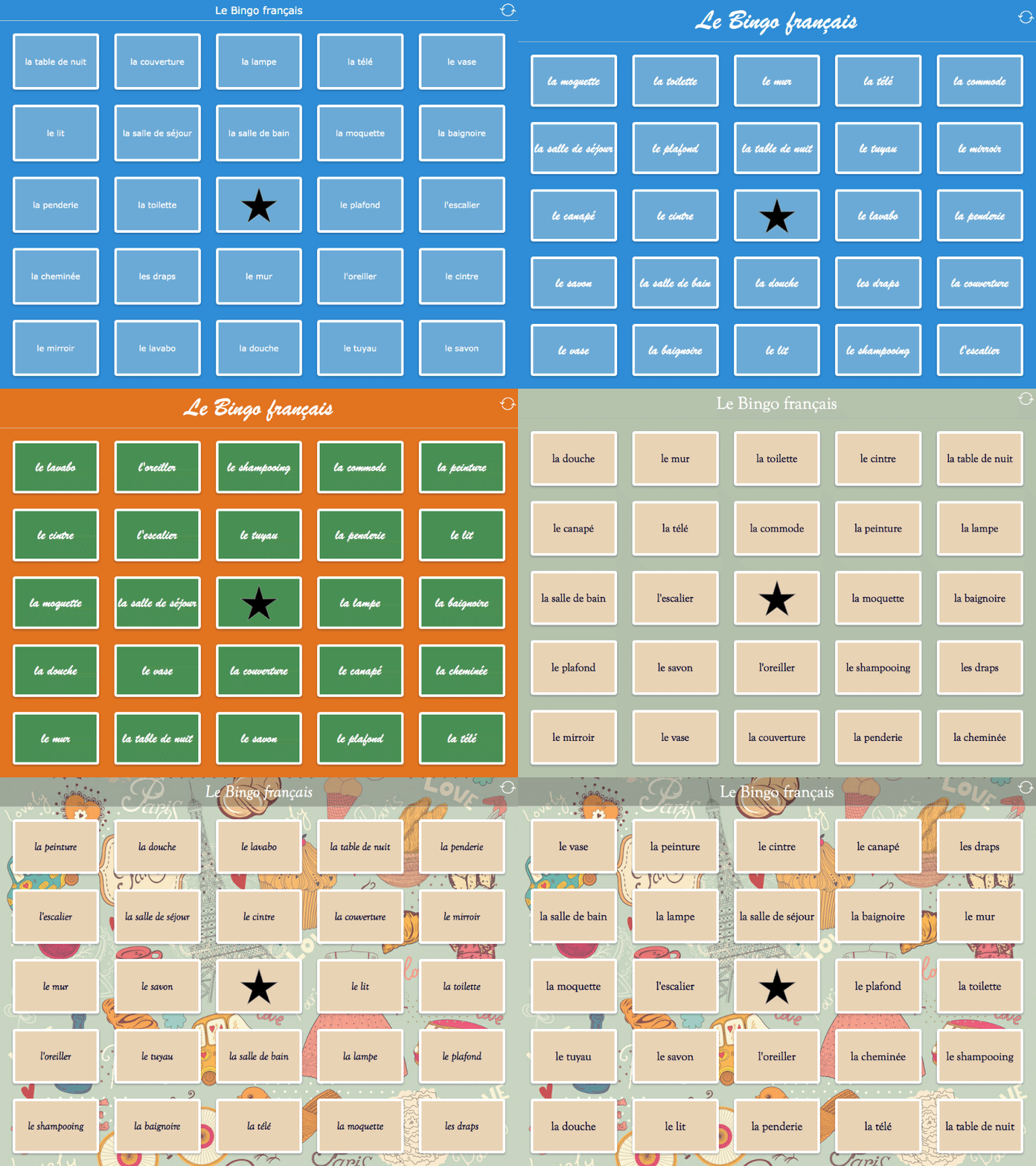
My ultimate tip here is to change the input fields in a fill-in-the-blanks question, an annotate picture question, or a text drag & drop question. Check out the example widget below. You can copy the widget to take a look at the design settings.
9. Crossword and word search next level ⭐️⭐️
With a bit of creativity and the extra design options, you can make next-level BookWidgets games.
Crossword
Check out this crossword widget below. I’ve shared a link so you can use it
right away with your students. I know you’ll have to wait a few months before
you can use it. 🎅 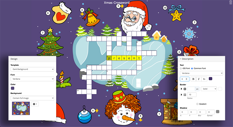
What’s so special about this crossword activity?
This crossword puzzle has no description. So when students want to enter a word, no description will appear. In the configuration, you only add the words students have to find.
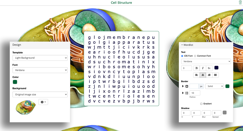
To really clear the description boxes in the crossword game, you have to tweak the extra design options. Go to Preview > Design > Description and put the size of the font on 0. Make sure the box has no Border or Gradient.
The background image is the clue here. It will tell your students what to enter in the crossword riddle. So don’t forget to add a clear background image with all the tips and clues.
Check the image above to see the right design settings.
Word search
Again, in this word search widget, the configuration and design settings are just like in the crossword widget above. Don’t enter a description, add a background image for visual support, and edit the wordlist design to make it disappear.
Check out the image below for the settings and click on it to share this exercise with your students. Students must find the 11 parts that are typical of the human cell structure. They don’t get any other support (such as a wordlist), as this exercise is intended for practice.
10. Save time with templates ⭐️
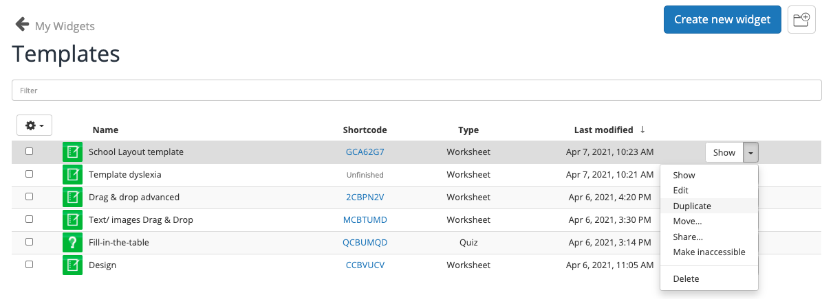
Changing design settings over and over again is very time-consuming. That’s why you can make a template. It’s pretty easy. You actually just create a widget with all the design settings like you want. Then, when you want to create a new exercise you can start from your template widget.
How to create a template with BookWidgets? Just create a widget with all the right design settings and place it in a folder called “Templates”. Now, click on the little black arrow on the right of the template widget and choose “Duplicate”. You now have a copy of your template. Just start adding content.
Wrap up
So tell me, what was new for you today? Share this post with fellow teachers so you can all adapt your lessons’ design to each other.
There are a lot more possibilities, but I’ll leave that for you to figure out. One piece of advice: KISS: Keep it smart & simple. Don’t mix too many colors, don’t use a fancy font that is hard to read. The content of your digital lesson is what counts most. We designed BookWidgets in a way that you don’t need to worry about design. But if you want, you can.
